Tabitha
Progressive Web App
My role: Branding, user experience, and interface design for a digital payment app created with three talented devs.
/*Indie Startup*/
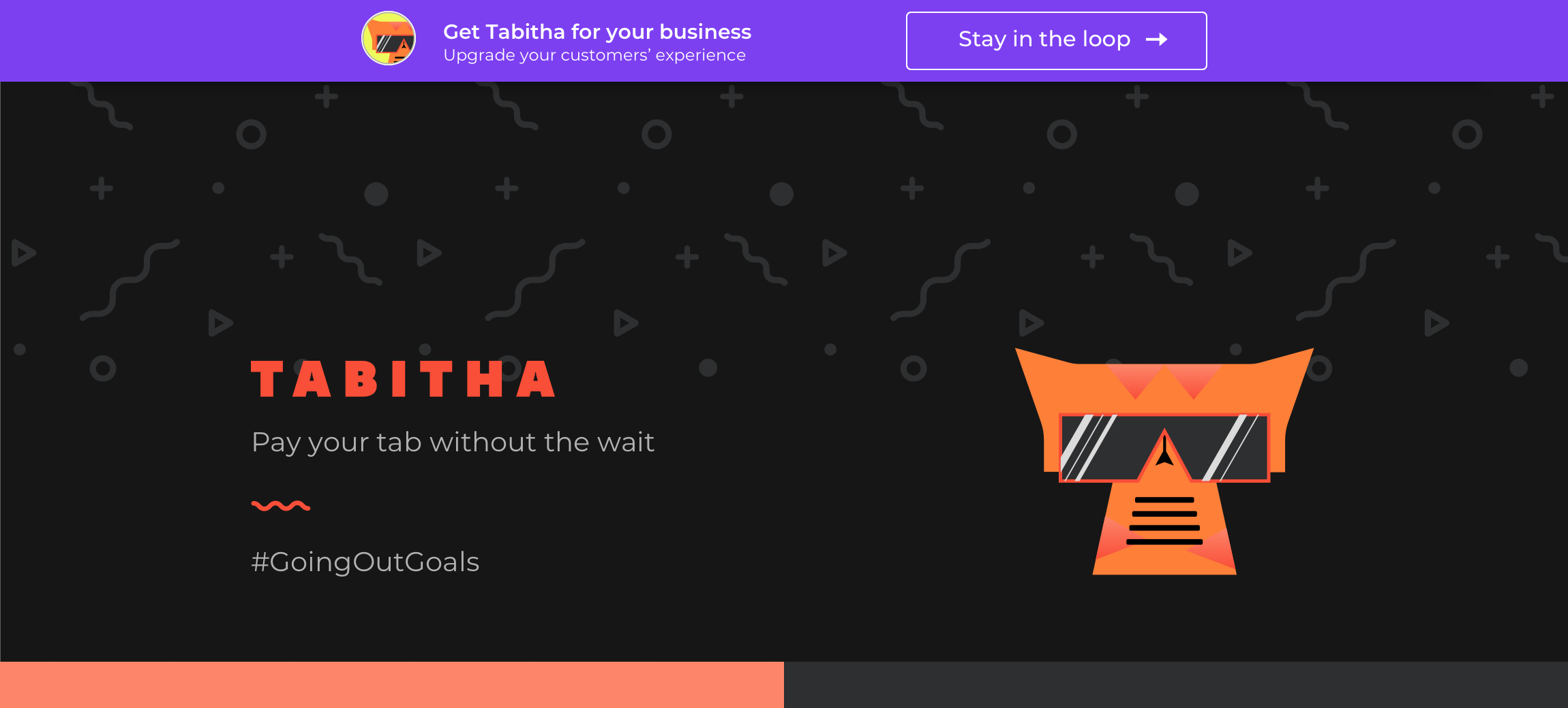
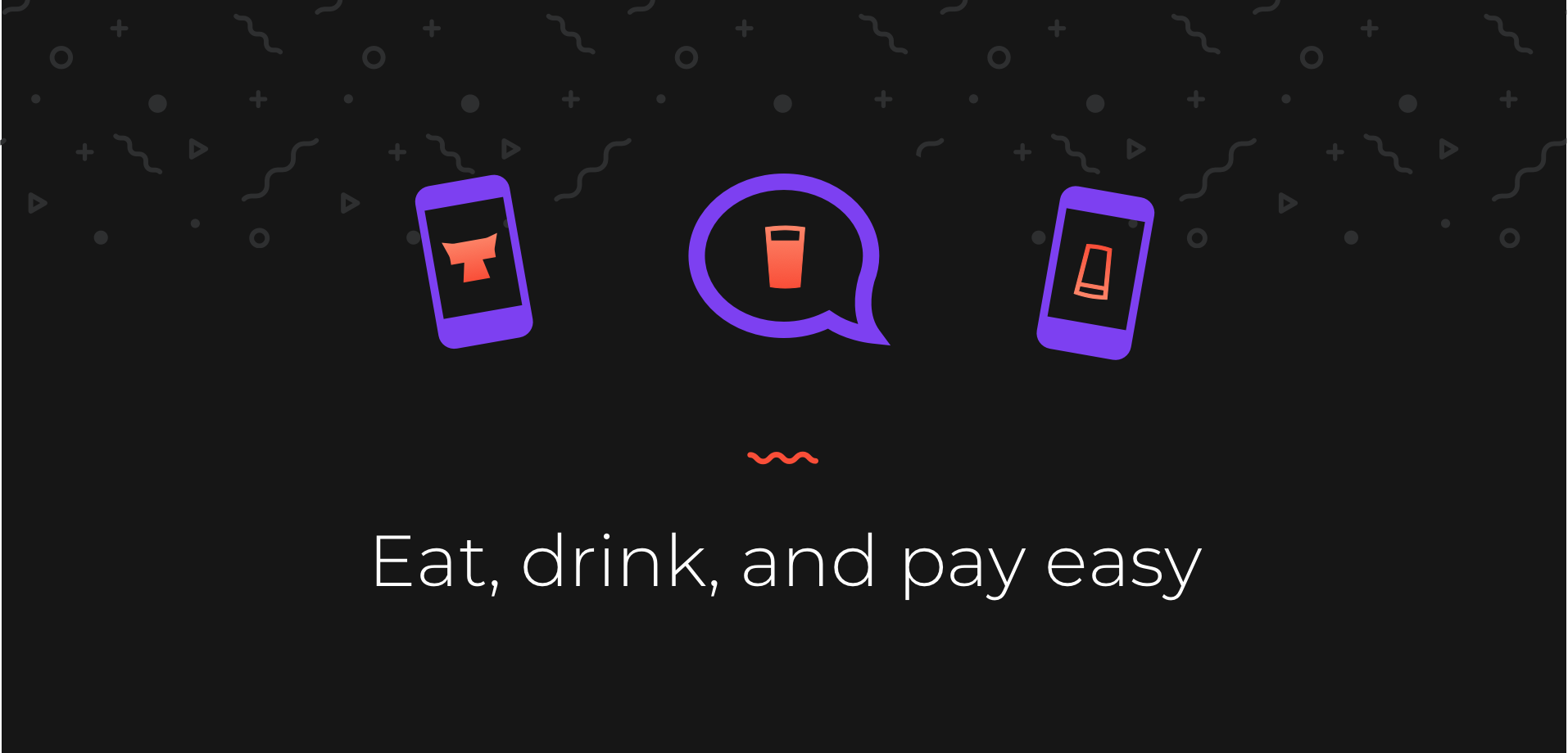
A differentiating factor from other bar tab apps is Tabitha’s target audience: college students patroning college bars. So we made our mascot, Tabitha, a VIP/party animal!
A differentiating factor from other bar tab apps is Tabitha’s target audience: college students patroning college bars. So we made our mascot, Tabitha, a VIP/party animal!
A differentiating factor from other bar tab apps is Tabitha’s target audience: college students patroning college bars. So we made our mascot, Tabitha, a VIP/party animal!
A differentiating factor from other bar tab apps is Tabitha’s target audience: college students patroning college bars. So we made our mascot, Tabitha, a VIP/party animal!
A differentiating factor from other bar tab apps is Tabitha’s target audience: college students patroning college bars. So we made our mascot, Tabitha, a VIP/party animal!
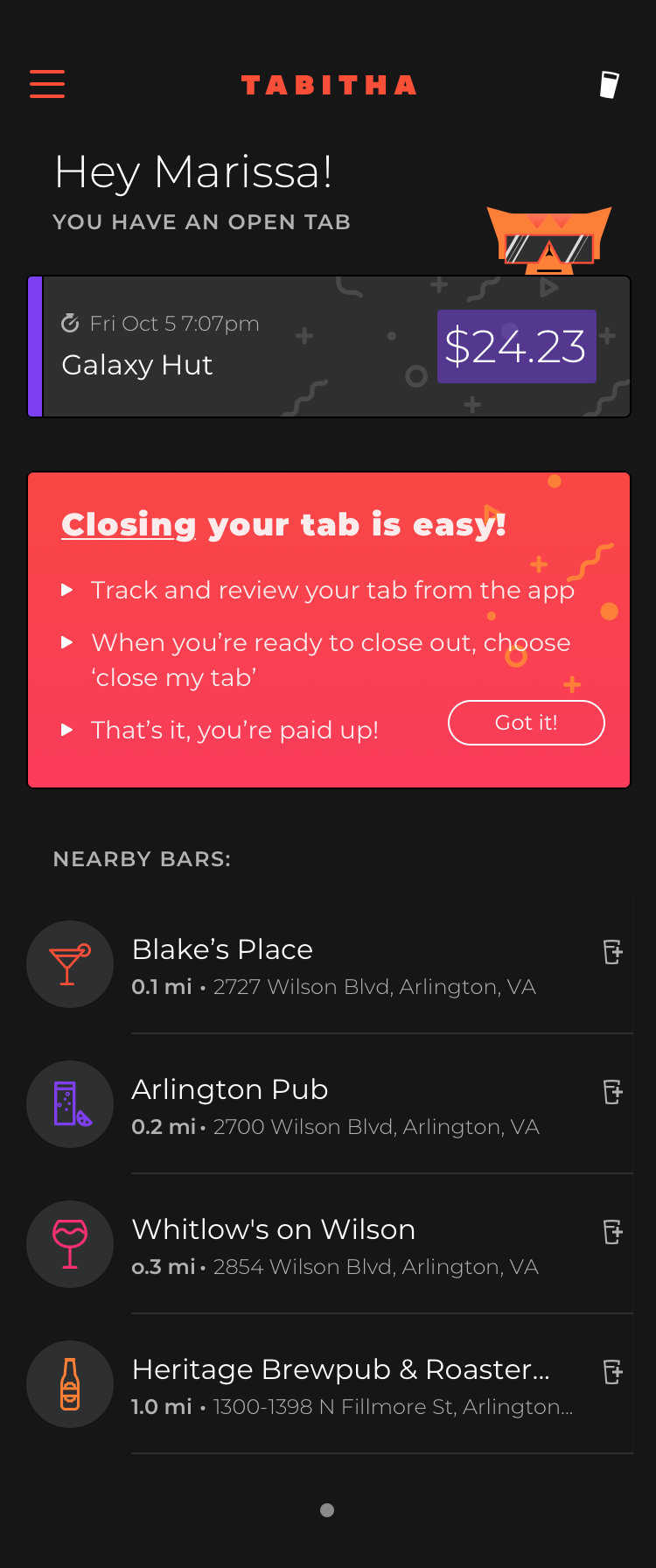
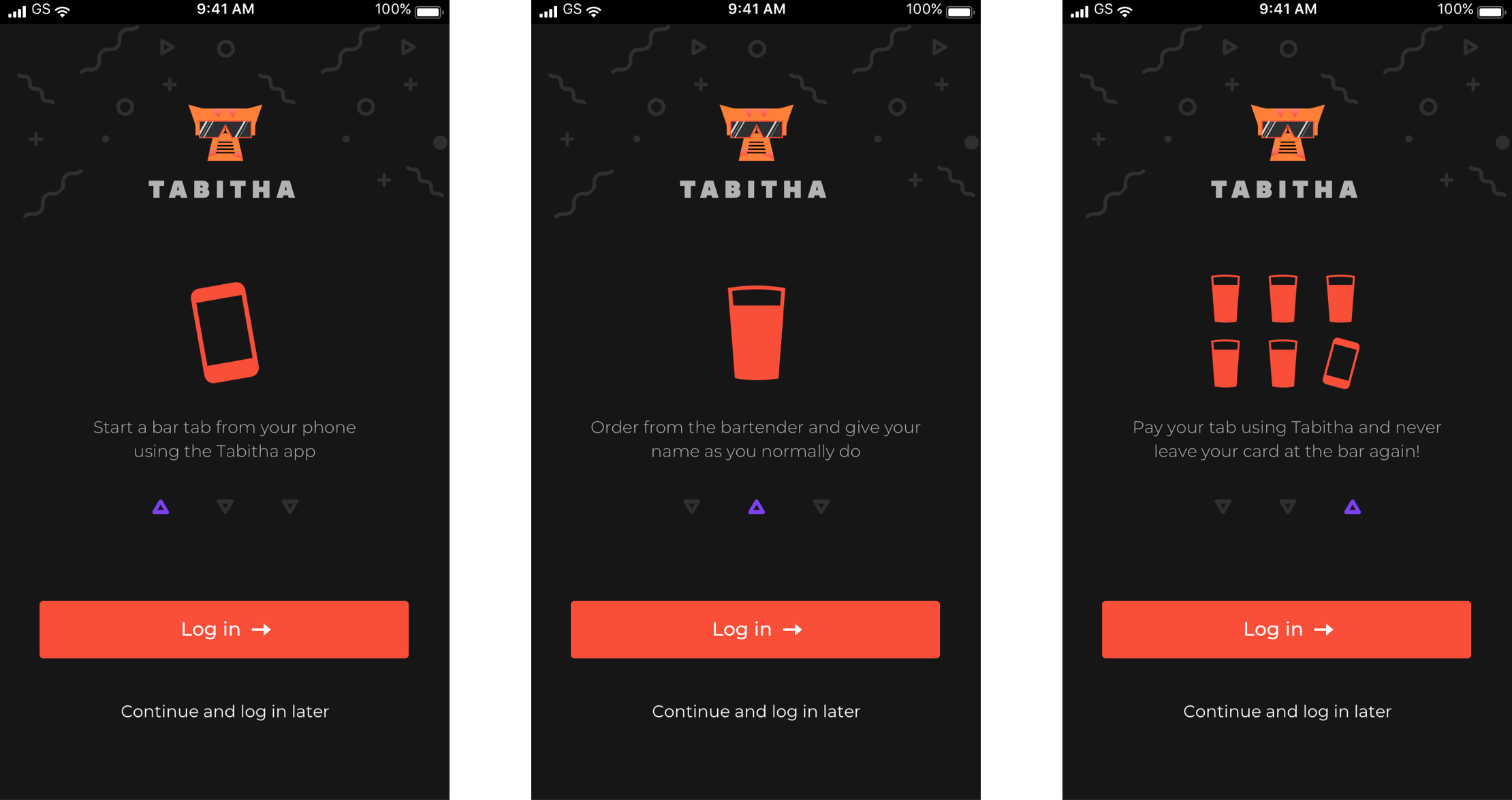
Going with a dark theme to accommodate use in dark bars, taking the age of our users into account, and striving for a seamless order/pay experience, apps such as Starbucks and Spotify served as great references.
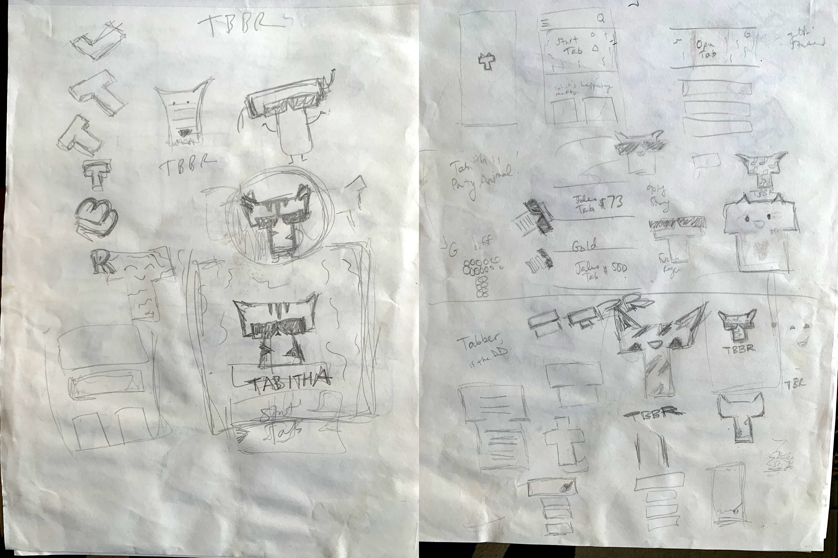
As the only designer on the team, I threw myself into a 360º product design role, crafting the user flows, the interface, preparing assets for prototyping & dev, and bugging them with viz QA ;)
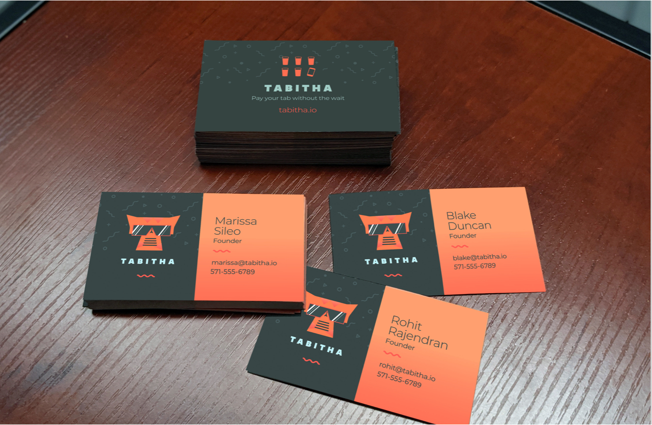
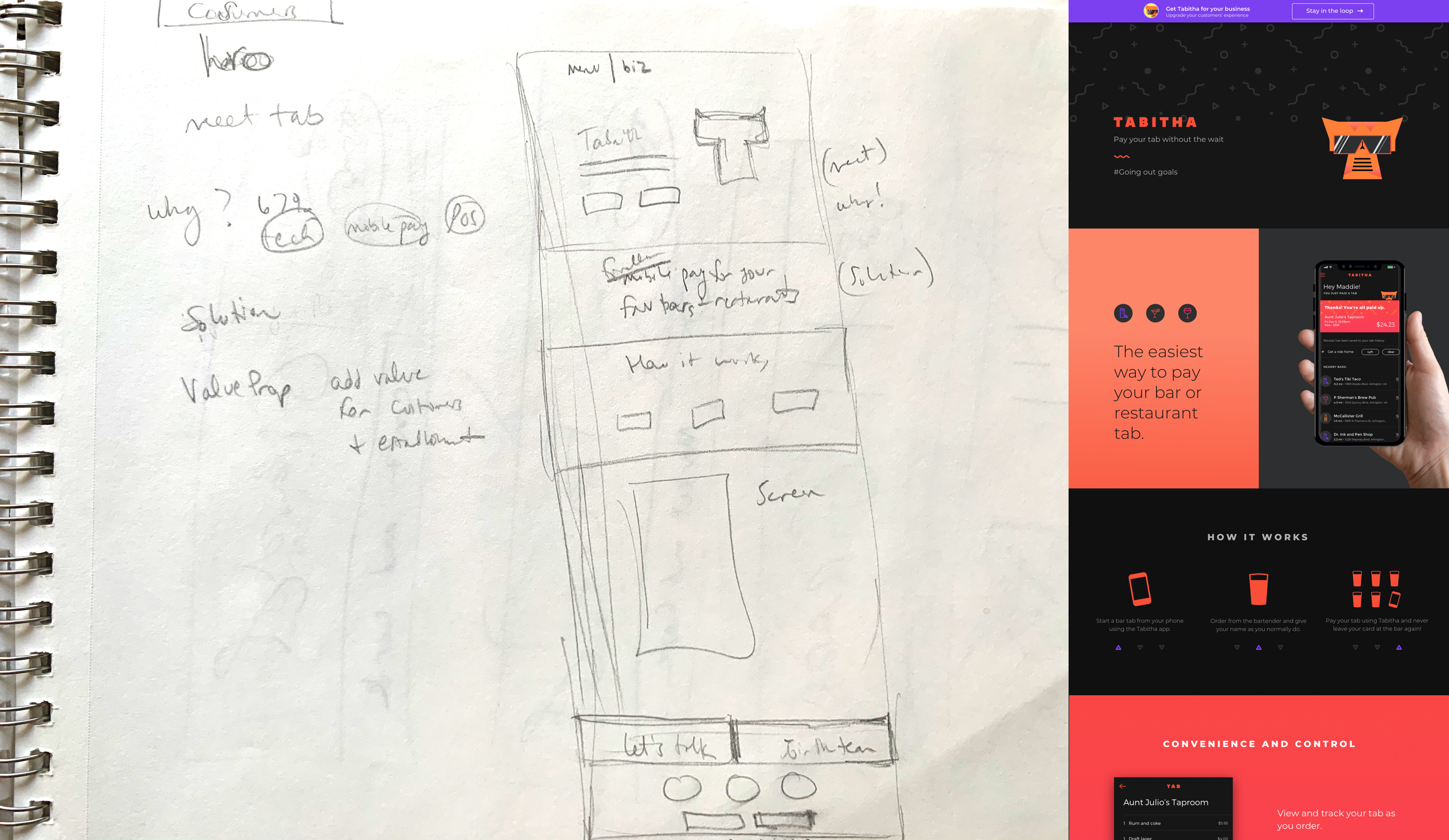
To showcase our product, we built a website, created pitch decks, and printed business cards.
To showcase our product, we built a website, created pitch decks, and printed business cards.
To showcase our product, we built a website, created pitch decks, and printed business cards.
To showcase our product, we built a website, created pitch decks, and printed business cards.
To showcase our product, we built a website, created pitch decks, and printed business cards.

View more projects
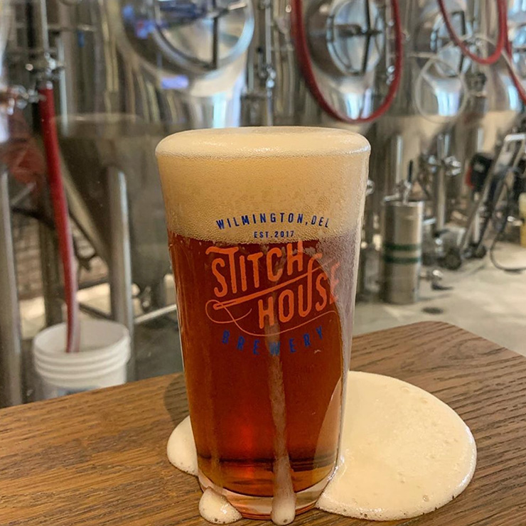
Stitch House BreweryRestaurant branding
Design System Component KitWebsite Production Management
Girard & FaireRetail Identity

PreclearanceAnimated Video
TennCare ConnectHealth Benefits Mobile App
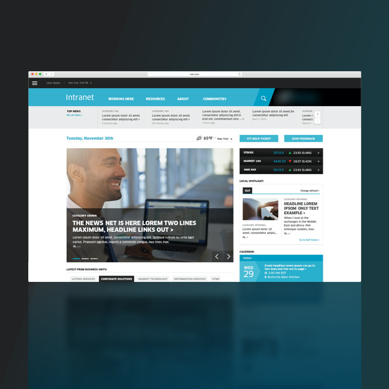
Corporate IntranetEnterprise Web Tool Redesign
Tech FluencyMobile Game
Connected VoicesiOS App & Data Visualization
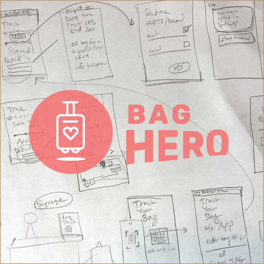
Bag heroFeature Flow
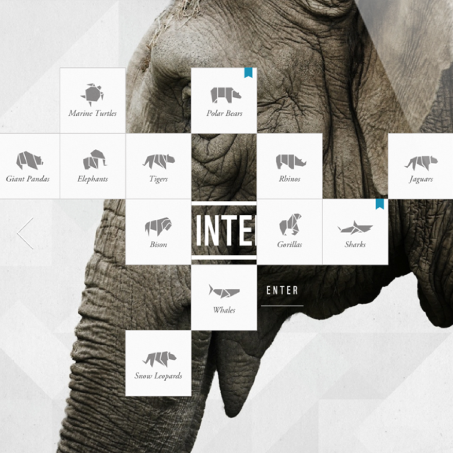
World Wildlife FundiPad App
Funk ParadeHybrid Mobile App
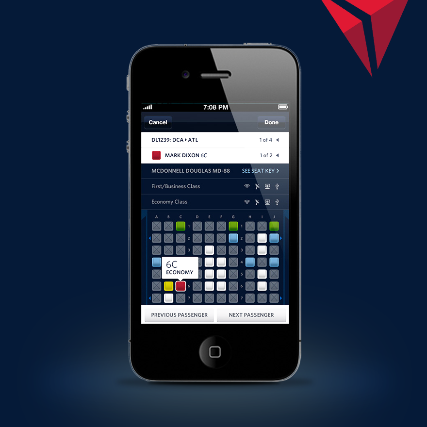
Fly DeltaNative Mobile App
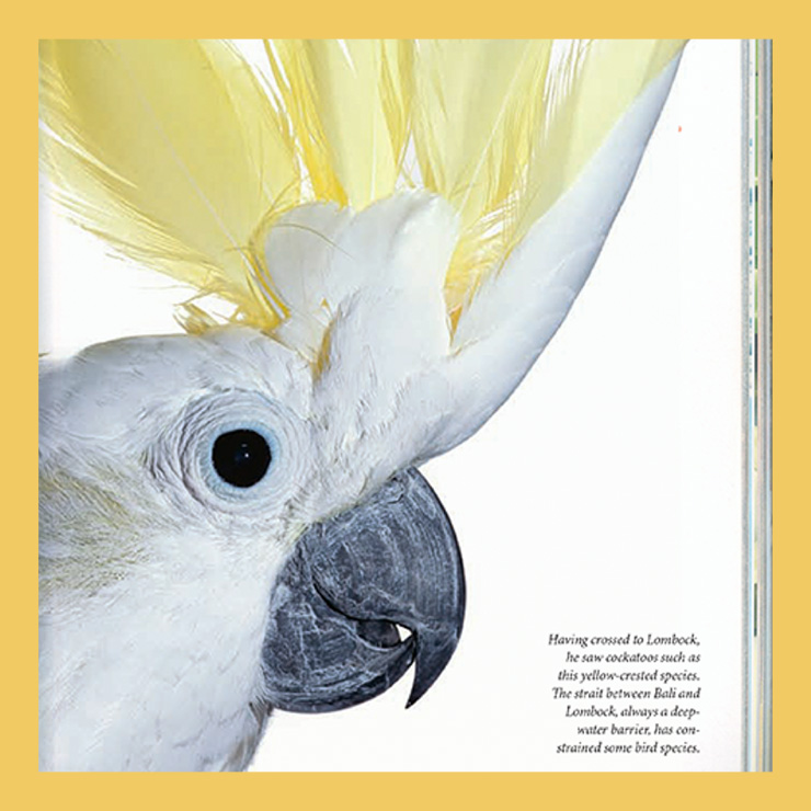
National Geographic MagazineEditorial
Copyright 2022 all rights reserved
Visit my cargo site
Washington, D.C.
Copyright 2020 all rights reserved
Visit my cargo site
